
 Downloads
 !C8Hypela/M!!fN+hj5wFeatured Creator
- Posts : 129
Join date : 2021-04-28
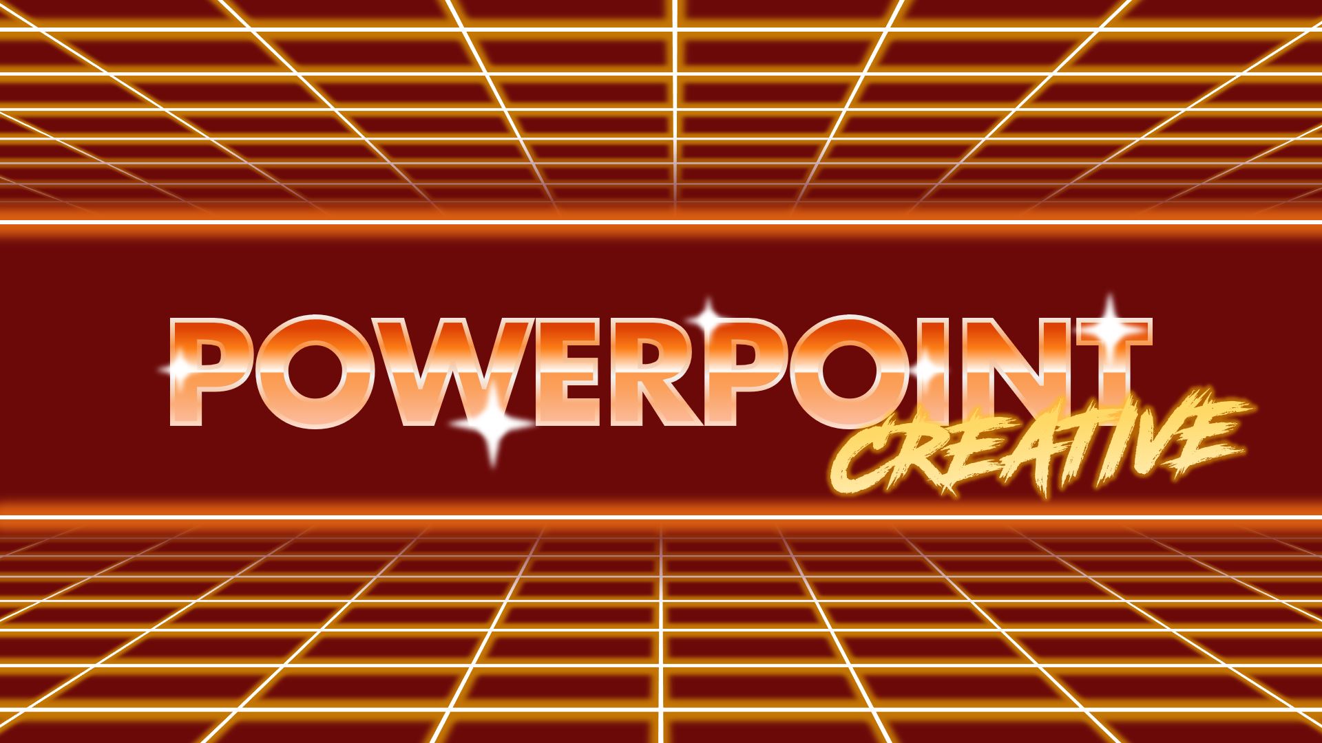
20220422
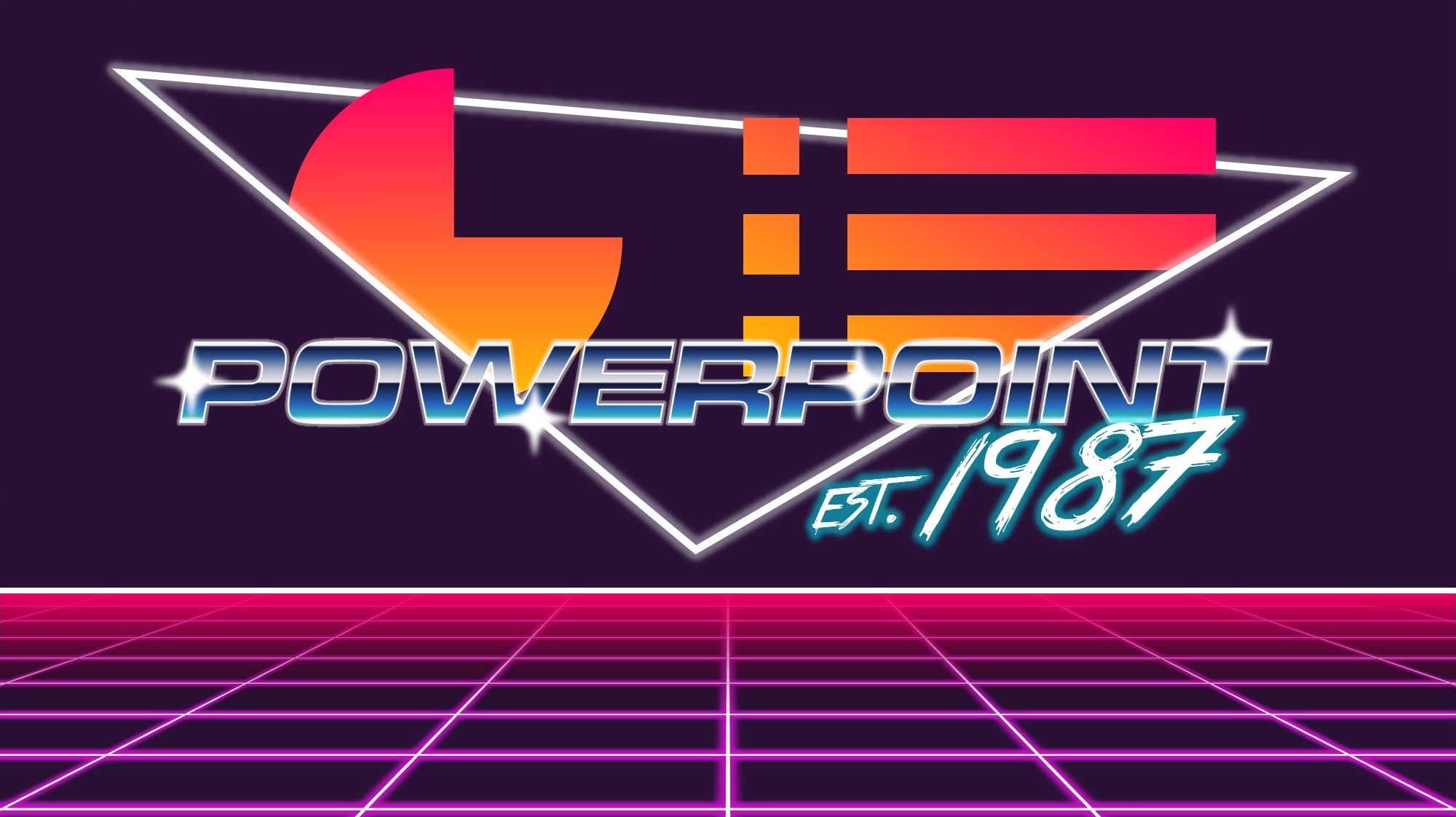
Scrolled through pinterest with this theme, then I felt like creating something of it.
Fonts I used were "True Lies" and my favorite typeface "Microgramma". Maybe I'll post the raw PPT later, since Microgramma is not a file-embed-able font and all the letters in this graphic is still in the form of textbox, it would all fall apart if I upload it now.
I really like how this one turned out though, probably my favorite creation thus far.
Also took some inspiration from this tutorial video, you guys want to try recreating something like it perhaps?
rusnakcreative and Jarek like this post
Share this post on:
Comments
Fri Jul 01, 2022 8:34 am
Late reply (verrrrrrrrrry), but... graphics of the old Powerpoint logo, Imao
That pie chart and bunch of lines had consistently appeared on the logo for decades.
P.S. Font is the one and only, Microgramma, my all time favorite, the goat.
Last edited by !C8Hypela/M!!fN+hj5w on Fri Jul 01, 2022 8:37 am; edited 1 time in total (Reason for editing : added font name)
That pie chart and bunch of lines had consistently appeared on the logo for decades.
P.S. Font is the one and only, Microgramma, my all time favorite, the goat.
Last edited by !C8Hypela/M!!fN+hj5w on Fri Jul 01, 2022 8:37 am; edited 1 time in total (Reason for editing : added font name)

Tue Jul 05, 2022 7:54 pm
Hey, this is looking really sharp! I had an idea, what if the current PPC logo got an upgrade? I really like how you have the graph coming out of the triangle in the background. Would you like to try to come up with a couple retro-futuristic versions of the logo for the forum and one of them could be the new PPC logo?
Jarek and !C8Hypela/M!!fN+hj5w like this post

Wed Jul 06, 2022 3:12 am
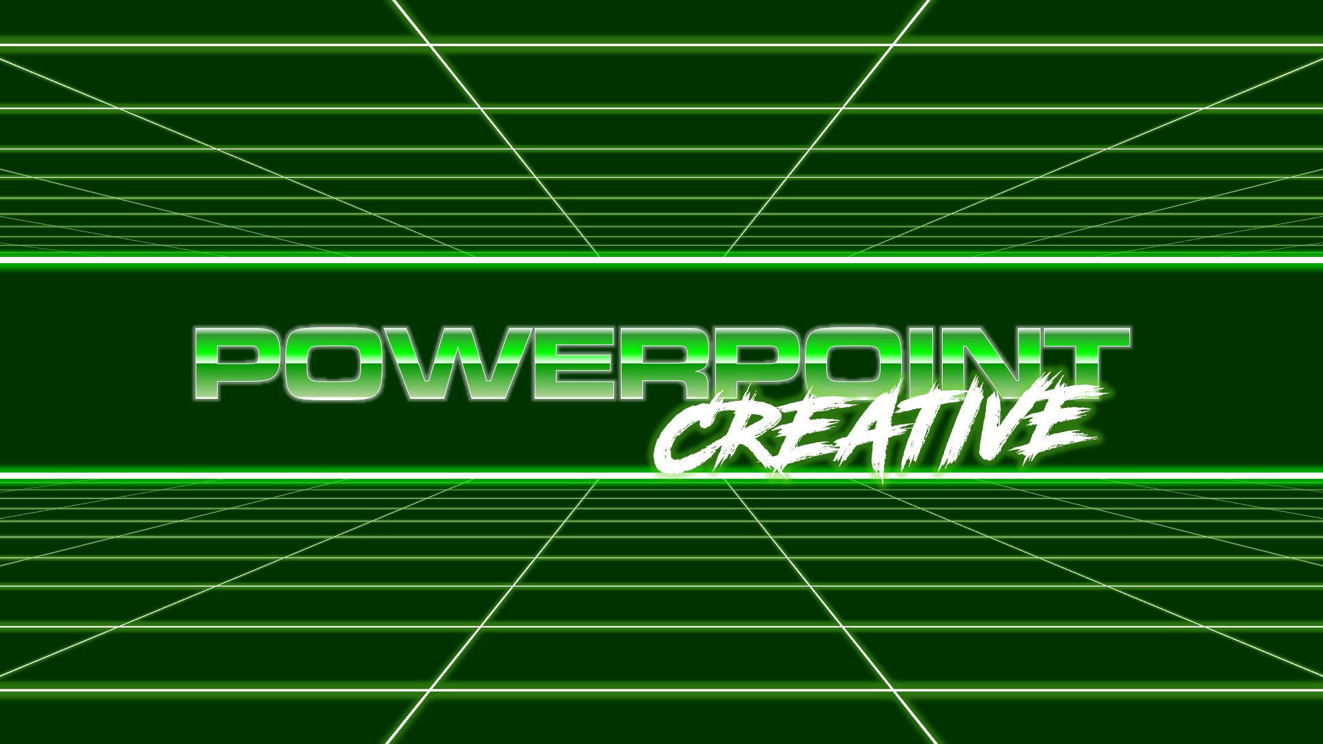
I agree. Take us into the 22nd century!
Jarek and !C8Hypela/M!!fN+hj5w like this post
Wed Jul 06, 2022 5:18 am
Oh my god you guys, okay okay.
I'll try coming up with something, no promises though. In the meanwhile, I'd probably make some more of these with all sorts of variation, gotta get those retro-futurism vaporwave design mindset in-tune first.
I'll try coming up with something, no promises though. In the meanwhile, I'd probably make some more of these with all sorts of variation, gotta get those retro-futurism vaporwave design mindset in-tune first.
Jarek likes this post

Thu Jul 07, 2022 10:08 am
!C8Hypela/M!!fN+hj5w wrote:gotta get those retro-futurism vaporwave design mindset in-tune first.
How's it coming?
Mon Jul 11, 2022 6:59 am
Its coming alright >.<
Thoughts that come to mind, is it really fine to change the current graphic? I mean, teachers/educators and formal workers visited this site... And a forum site with such a swag banner doesn't seem like a place they'd hang around in...
Idk, probably belongs in the random thought thread instead of here haha
Mon Jul 11, 2022 7:11 am
I was an educator, and a 'formal worker' (if I get your drift) and I would certainly be happy to see a 'swag' banner even though I don't know what that means. 
!C8Hypela/M!!fN+hj5w and JadeJohnsonIndustries™ like this post
Mon Jul 11, 2022 7:18 am
Actually, do a job with the banner that we'll be proud to show and you will have earned your Featured status.
Mon Jul 11, 2022 8:02 am
Huge passive-aggressive energy from John, uh oh. is a frickin blood contract, how did I not see this coming?!
Anyways, here's what I've been working on. Definitely not taking the color palette from the data log UI the other day.
I was planning to create a grid mountain for the background, but I hadn't quite been able to hit it properly.
Pinterest is my best friend at the moment.
Font for this one is Road Rage btw
https://www.dafont.com/road-rage.font
 is a frickin blood contract, how did I not see this coming?!
Anyways, here's what I've been working on. Definitely not taking the color palette from the data log UI the other day.
I was planning to create a grid mountain for the background, but I hadn't quite been able to hit it properly.
Pinterest is my best friend at the moment.
Font for this one is Road Rage btw
https://www.dafont.com/road-rage.font
Mon Jul 11, 2022 8:34 am
If it's any help (which it probably isn't) my son runs a graphic design company and their policy is to provide a range of logos and variations for the client to choose the one they like best. Just sayin'.
And just to clarify, it wasn't me that gave the status upgrade.
And just to clarify, it wasn't me that gave the status upgrade.
Wed Jul 13, 2022 9:06 pm
Ooooh I love it!
I'd like to see some other variations too, especially one with keeping the same PPT orange used here as the primary color choice. You could combine that orange in a gradient with a nice shade of magenta where the orange is the closest and bottom-most color. I'd also like to see a variation with the elements of the PPT logo in the background, where the sunset is replaced by the pie chart and bullet points.
Feel free to try other color combinations if you think anything else might work. My only requirement is to make sure it works with the current PPT orange here. Unless, you can convince me otherwise to change up the whole color scheme of the forum to shades of green for a retro/matrix look? It'll have to take a lot of convincing to get me to say go for green, since green is for Excel, and we're a PPT community.
Looking forward to seeing what else you can come up with!
P.S. You're welcome
Thu Jul 14, 2022 6:12 pm
johnr wrote:If it's any help (which it probably isn't) my son runs a graphic design company and their policy is to provide a range of logos and variations for the client to choose the one they like best. Just sayin'.
And just to clarify, it wasn't me that gave the status upgrade.
Definitely not xP, still gotta do it though so fingers crossed.
rusnakcreative wrote:Ooooh I love it!
I'd like to see some other variations too, especially one with keeping the same PPT orange used here as the primary color choice. You could combine that orange in a gradient with a nice shade of magenta where the orange is the closest and bottom-most color. I'd also like to see a variation with the elements of the PPT logo in the background, where the sunset is replaced by the pie chart and bullet points.
Feel free to try other color combinations if you think anything else might work. My only requirement is to make sure it works with the current PPT orange here. Unless, you can convince me otherwise to change up the whole color scheme of the forum to shades of green for a retro/matrix look? It'll have to take a lot of convincing to get me to say go for green, since green is for Excel, and we're a PPT community.
Looking forward to seeing what else you can come up with!
P.S. You're welcome
Dont worry! I'm still just experimenting with things, I will surely go back to the roots of orange colors when making the real deal.

Tue Aug 02, 2022 1:49 pm
rusnakcreative wrote:Would you like to try to come up with a couple retro-futuristic versions of the logo for the forum and one of them could be the new PPC logo?
I know that I myself couldn't, simply because of my 25PPI-eyes, but that would be a fun little PPC-challenge in which all of those who wanted to partake might enjoy!
Fri Nov 04, 2022 7:14 am
I suck at mix-matching colors, so have this for now.
Color palette was from Powerpoint's Icon for the 2010 edition, I was a bit on a craze to Frutiger Aero aesthetic whilst making this. The glossy texture really looks charming, even in here.
Also, font is Futura. I don't know what anyone else thinks, but I think this one looks better than Microgramma (which I also made a version of, here). Futura just looked... more strong and firm, whilst Microgramma looked squished, like, ya know.
Road Rage looked nicer than True Lies, personal preference here. But let me know what you think, the handwritten strokes I mean. Well, and everything else I guess.
Fri Nov 04, 2022 7:24 am
Great work here Hypela!
I'm ok with either font, although if I had to make a choice I'd go for Microgramma. It looks a little more 'space age' and modern to me. Happy to go with the consensus though.
I'm ok with either font, although if I had to make a choice I'd go for Microgramma. It looks a little more 'space age' and modern to me. Happy to go with the consensus though.
!C8Hypela/M!!fN+hj5w likes this post
Fri Nov 04, 2022 8:32 am
Looks great!
I prefer this over Microgramma
I prefer this over Microgramma
!C8Hypela/M!!fN+hj5w likes this post
Permissions in this forum:
You cannot reply to topics in this forum|
|
|
The font for 'PowerPoint' is wonderful - is suspect this is the one that's not downloadable.
What does the graphic within the triangle represent? Looks like C E but I'm not sure.